HK Vitals
BRAND IDENTITY
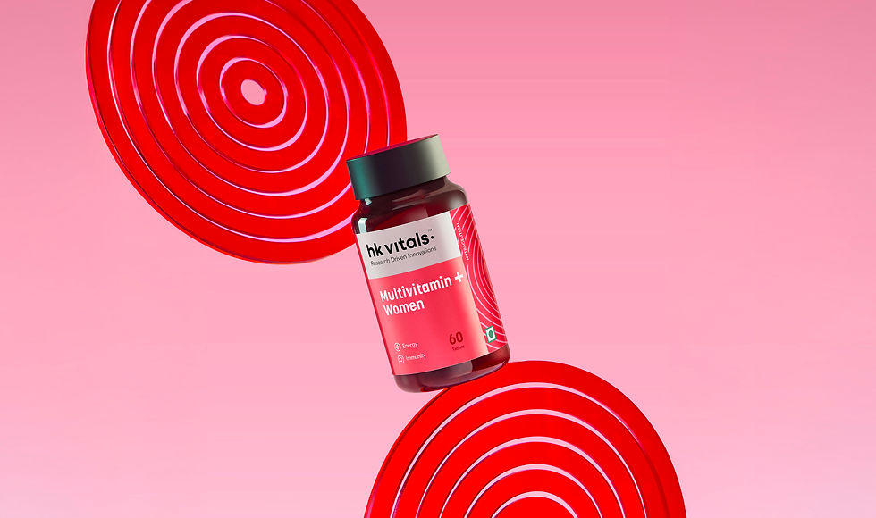
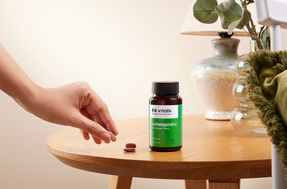
PACKAGING
BRAND COMMUNICATION, CREATIVE DIRECTION
Health Kart, a brand that has transformed the health supplement landscape in India comes HK Vitals. After years as a trusted nutrition partner,
HK Vitals sought to reintroduce themselves with a much more focused approach to vitamins, skin, and hair health.
I contributed to this rebranding project alongside
my team, helping develop the strategic narrative
and identity for HK Vitals as they shifted focus to vitamins, skin, and hair health. Our goal was to highlight their trust, expertise, and research-first approach through a renewed brand expression.


PROBLEM STATEMENT
The packaging for the entire portfolio of HK Vitals had a signature teal colour that was synonymous with the brand. While this made the range look vast, as the range grew, there was little to no distinction between either products or ranges.

THE SOLVE
The packaging for the entire portfolio of HK Vitals had a signature teal colour that was synonymous with the brand. While this made the range look vast, as the range grew, there was little to no distinction between either products or ranges.


CREATIVE DIRECTION


CREATIVE DIRECTION
Packaging intro


PROJECT CREDITS
Creative Director
Anushka Sani
Design Team
Shreya Chhajed
Jyothi Iyer
Aayushi Kapadia
Art Direction
Shreya Chhajed
Aayushi Kapadia
Strategy
Disha Pinge
Rohini Pandey
Divya Bhagat
Copy
Aishwarya Prabhala
Photoshoot Collab.
Ria Panjabi
Jueely Kadam
Shivani Goel
Ankita A
Project Management
Mesha Bhansali
Twinkle Bharadia
Urvi Dedhia
Nishita Mohta
Project Operations
Arjun Singh
Luigson Fernandes